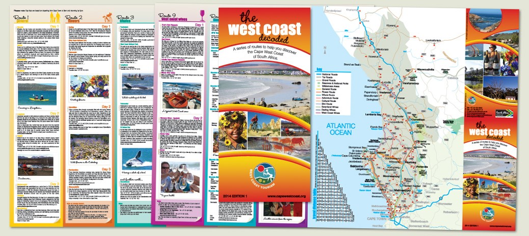
This is the latest edition of the West Coast Decoded Brochure, which is still going strong after so many years. This year an extra route was added and the brochure expanded by one whole panel. The cover design has also been updated to fit with the sister publication of the West Coast Travel Mozaic brochure.
All posts by Nicki
Logo Re-design for Breedekloof Wine Valley
This re-design was completed in 2013. We went through five stages of changes before the design was finalised and client is very happy with the result.
Website Design for Samoa Hotel
This simple, yet sophisticated website and logo design were created in mid 2013. Above also shows the e-mail signature image created. The Samoa Hotel is situated in the bread basket of the Swartland region in a little town called Moorreesburg, which is in the heart of the agricultural region north of Cape Town. Click on the image above to visit the website.
Website Design for Atlantic Rope Access
Pull-up Banner Designs for Swartland Municipality
These banners were designed in 2013. The two on the left were done for the Sondeza Afri-Youth Camp hosted by the Municipality each year in December. This event is aimed at youth and attended by both local and international young people with leadership workshops and training given over the week long period. I used the bright colours of the event logo as well as photographs of activities held at past events.
The right three are generic banners for showing the vision, mission and statement of the Swartland Municipality using the three colours of their logo and some beautiful scenic photographs of the area. I have also previously created new artwork for the Swartland Municipality logo.
Menu Design for Janno Cafe, Restaurant & Bar
This bistro-styled menu was designed for Janno in 2013. The typesetting is uncomplicated – making it easy to read and use, while still being quite elegant. Newer editions will have different header colours for a bit of interest.
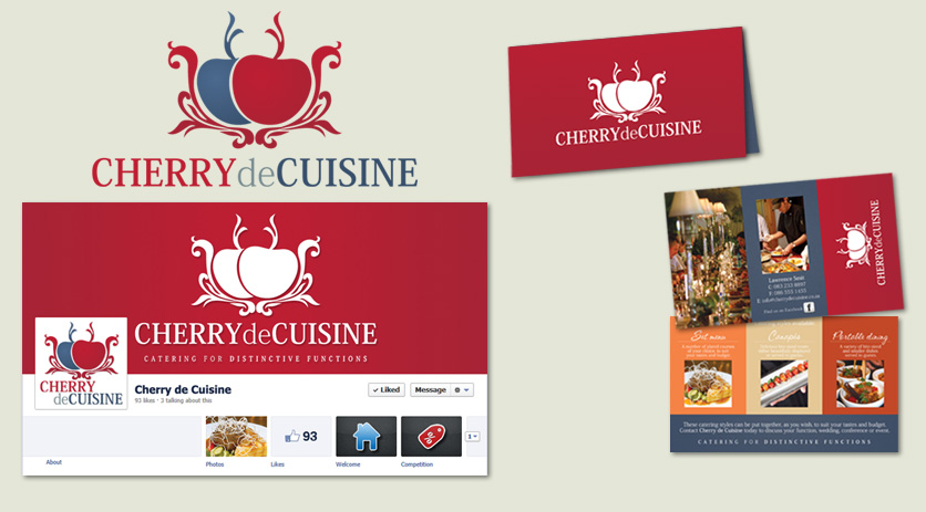
Logo and Business Card Design for Cherry de Cuisine
This logo design for a catering company can be used in its three colour version or as one colour – as shown here – for embroidery onto caps or aprons. I also created a ‘mini brochure’, which is a business card size, with a gate fold and some further information and photographs than could fit on a standard card. It was matt laminated for a smooth feel.
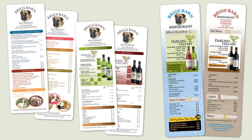
Menu Design for Brigs Barn
This shows the menu design for the past two years for Brigs Barn in Darling which I produce for my client, Darling Cellars. They are printed on quite thick stock and matt laminated for a sophisticated smooth feel with rounded corners to attempt to prevent frayed edges.
Poster Design for CapeNature
This poster design for CapeNature was later adjusted to become a signboard to be placed along the Olifants and Doring Rivers.

