Category Archives: Design for Print

All sorts of designs, which at some point will or have been printed – such as a flyer or perhaps even signage.

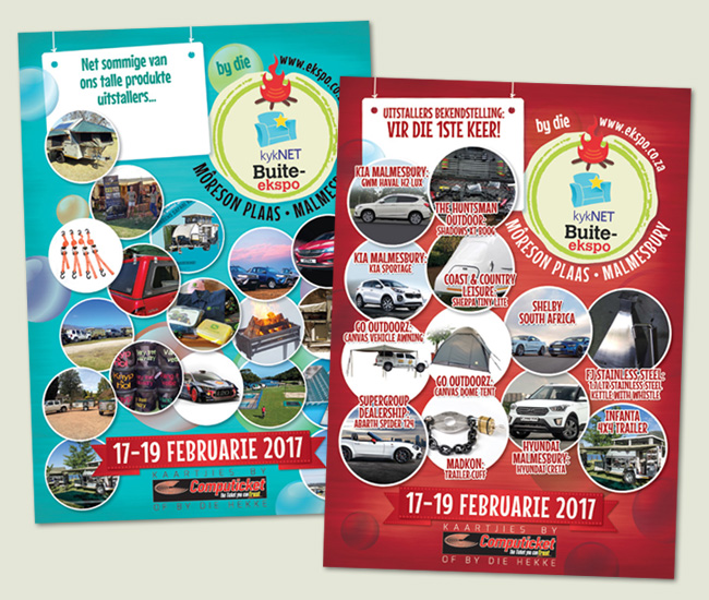
Designs for the 2017 Western Cape kykNET Buite Expo

These are various ads and facebook post images created for the kykNET Buite Expo, which happens in February at Môreson Farm in the Western Cape. 

Artists and Play Park Flyer

Above and below shows some of the flyers created for the Buite Expo. These are featuring the musicians who would be performing, the fun rides at the kids play park and various products which would be exhibited on the weekend.

Products Flyer for the Buite Expo

Below shows just some of the Facebook post images created for the many outdoor activities available on the weekend, which included helicopter rides, camping and 4×4 rally rides and test drives.

Activities for the Buite Expo

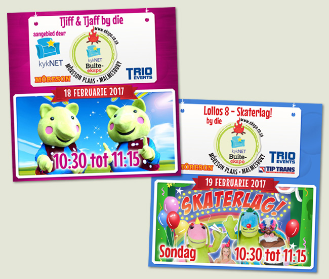
Below shows some of the kids activities for the kykNET Buite Expo, which included shows by the very popular Lollos and Tjiff & Tjaff.

Kids Activities at the Buite Expo

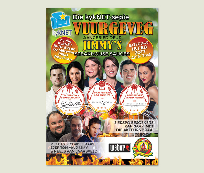
And last, but not least is the flyer design for the kykNET-sepie Vuurgeveg, which in english is the kykNET Soapie Braai Challenge (sort of) where actors from three South African soap operas compete at cooking something on hot coals as is our South African tradition.

Vuurgeveg Flyer Design

Just a note that I did not design any of the logos seen here so I’m only responsible for the layout designs.

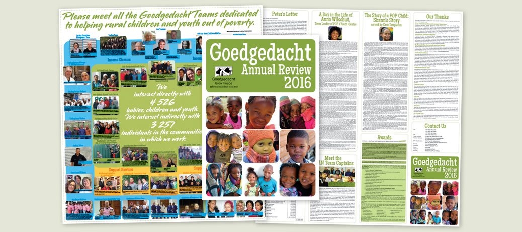
A5 Annual Review Design for Goedgedacht Trust 2016

This year the brochure is missing Sue Beattie’s charming illustrations, but for a good reason. The 2016 Annual Review features photos of all the staff and wonderful people who make the Goedgedacht Trust the success it is today.

It was quite a project to get all the photos in place with the correct names and such, but after a few revisions and corrections the final product was sent to print in October 2016. Hats off to the wonderful team behind the scenes who made it happen!

Click here to see the 2015 and 2014 designs.

A2 Folded to DL Brochure Design for Swartland Tourism

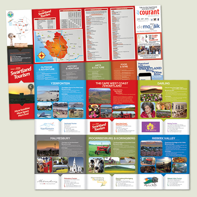
This brochure was given a fresh, new design in July 2016. We changed the layout from the previous design to feature each town in the region on one side including contact details for each tourism office.

Swartland Tourism Brochure 2016

On the reverse we included a smaller map showing the main connecting roads linking the towns, an events list and a list of establishments along some different themes like Outdoor & Adventure and Food & Wine.

Label Designs for Wildehurst Wines and Velo Range

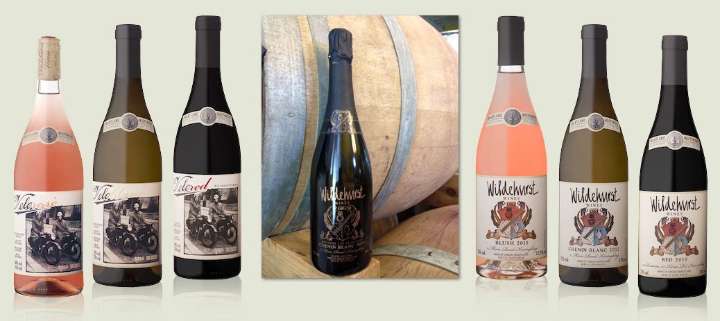
This is the range of wine labels I’ve designed for Wildehurst Wines. The original ‘badge’ was painted by an artist for the owner and I recreated it in vector format and added the Schnauzers, Aloes, the bottom scroll and a few other elements. The Velo range of wines uses an image of the owner’s husband as a young man with one of his best friends and their Velo motorbikes.  Below is the newest addition to the range, which is the 2016 Chenin Blanc Méthode Cap Classique.

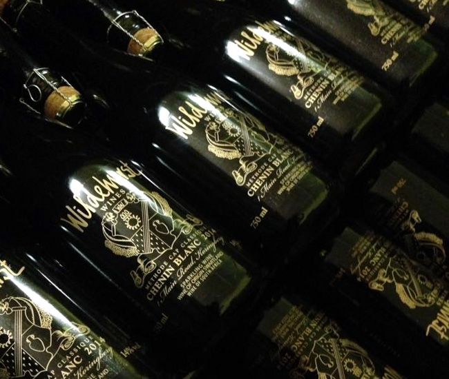
Wildehurst Wines MCC

Above is a shot of the bottles on the production line – all shiny and new! We did metallic gold on a clear adhesive label to give the effect of clear glass. The neck tag repeated the gold on a black background – a very classy finish.